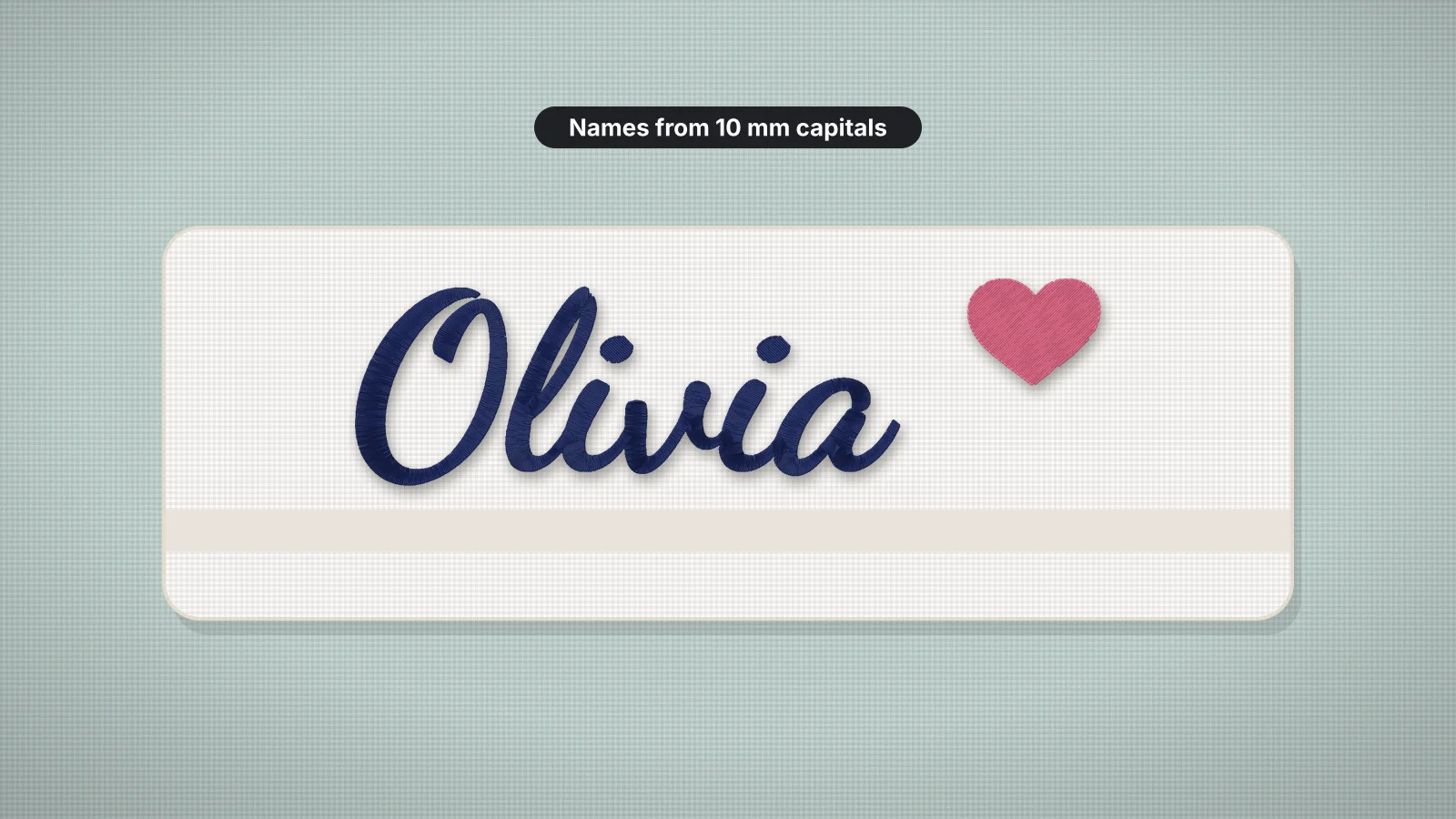
Names are the most requested embroidery there is: a child's name on a backpack, staff names on uniforms, a baby's name on a blanket, a name on a towel for a gift. They look simple, but lettering is where embroidery is least forgiving. Letters that are too small fill in, thin scripts disappear into towels, and a name a few millimeters off center is the first thing anyone notices.
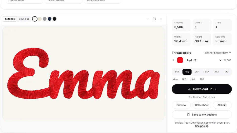
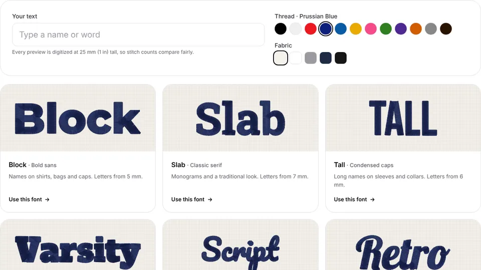
This guide covers the choices that make a name stitch cleanly: the font, the minimum letter height for each style, sizes for common placements, centering, stabilizer and a test sew. To try a name in every lettering style at once, type it into the embroidery font previewer.
Choosing a font for a name
| Font | Style | Smallest capital height | Best for |
|---|---|---|---|
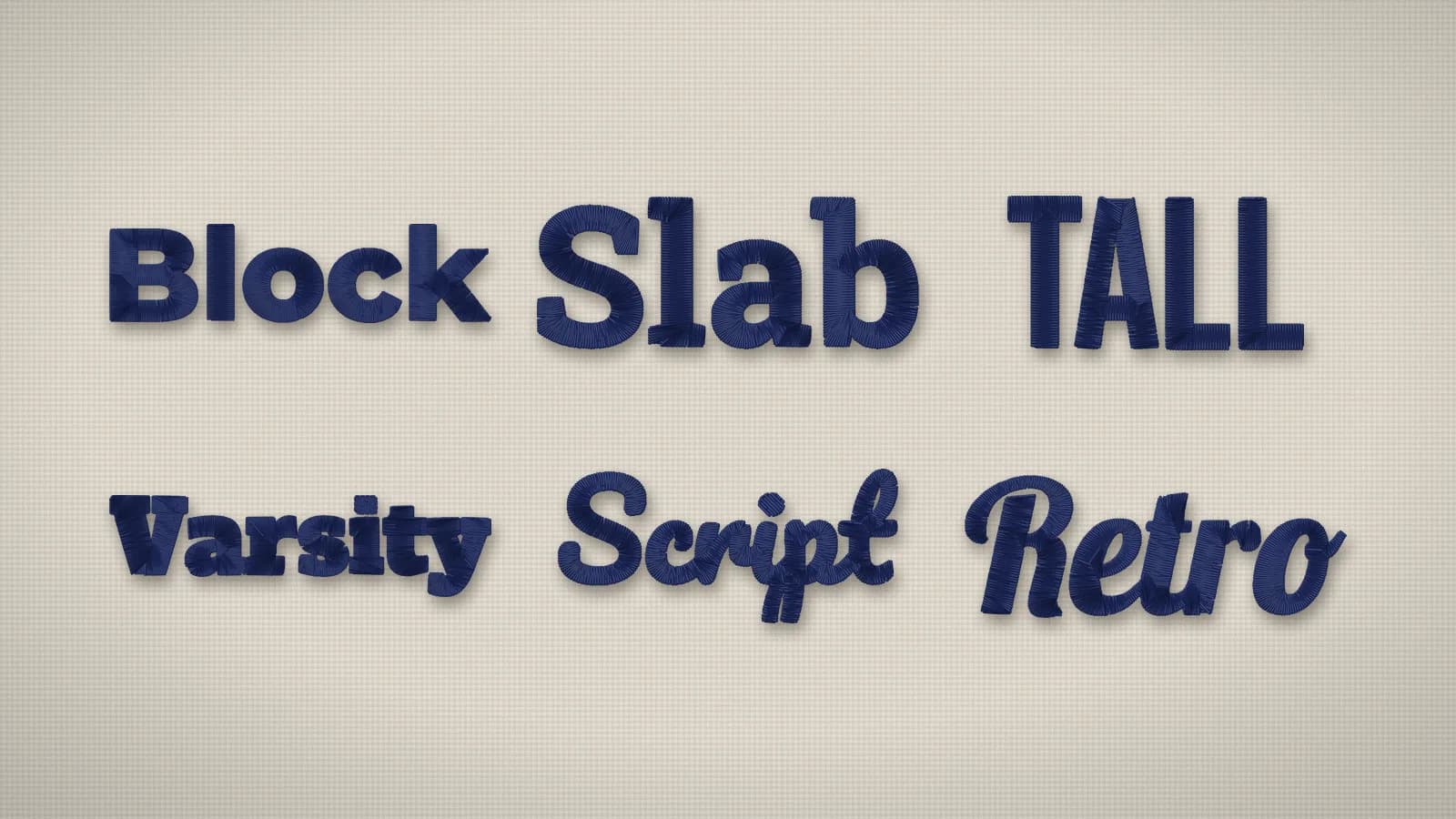
| Block | Bold sans | 5 mm | Names on shirts, bags and caps |
| Sport | Condensed sans | 5 mm | Workwear, jerseys and bold headlines |
| Rounded | Soft sans | 5 mm | Kids' clothes, pets and playful brands |
| Tall | Condensed caps | 6 mm | Long names on sleeves and collars |
| Varsity | Heavy slab | 6 mm | Team names, numbers and sportswear |
| Slab | Classic serif | 7 mm | Monograms and a traditional look |
| Roman | Roman capitals | 7 mm | Crests, clubs and classic branding |
| Classic | Elegant serif | 8 mm | Wedding linens and formal monograms |
| Script | Rounded script | 10 mm | Gifts, baby items and towels |
| Retro | Bold script | 10 mm | Shop names and vintage logos |
| Brush | Brush script | 10 mm | Sporty slogans and hand-made looks |
| Flowing | Flowing script | 12 mm | Signatures, quotes and keepsakes |
Bold fonts with even strokes stitch best, because every part of each letter is wide enough for a satin column. Scripts are the classic choice for gifts, but their thin joins need height, and mixed case reads better than all capitals in a script. Tall and Roman are capitals only.
Use one font per item, or two that contrast clearly, such as a script name over a block tagline. More than that looks busy at name sizes.
Minimum letter height
Letter height is measured on a capital letter, and the minimums above are for flat, stable fabric. Go bigger whenever the fabric fights the stitches:
- Lowercase is smaller than capitals in the same font. If lowercase letters such as a, e and o drop under about 4 mm, switch to capitals or enlarge the name.
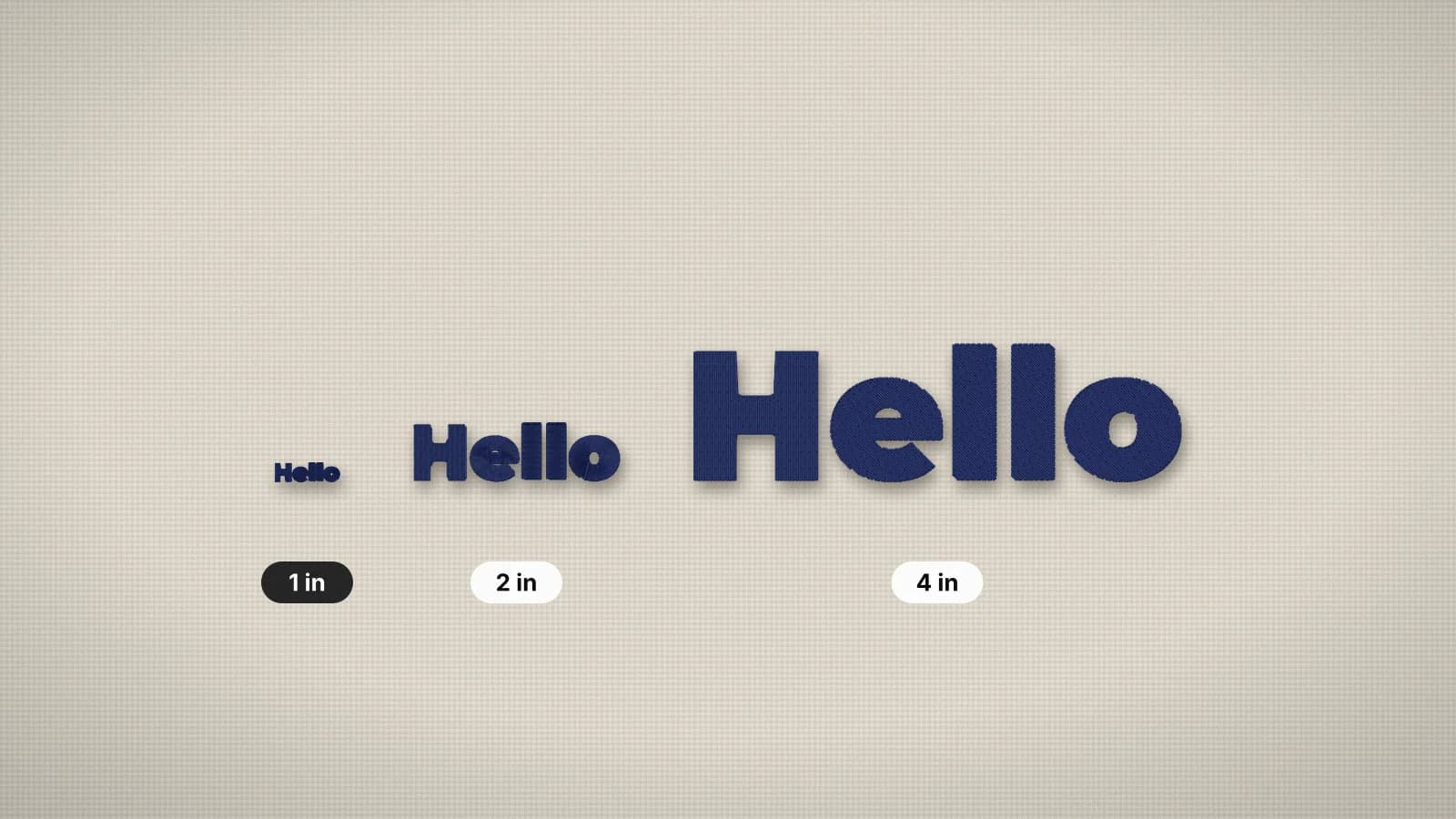
- Textured fabric such as piqué, fleece and terry hides stitches. Add 1–2 mm to the minimum, and keep script names on towels about 25 mm (1 in) tall or more.
- Caps need letters at least 6–7 mm tall, because the thick, curved front swallows thin strokes.
- Stroke width matters as much as height: keep strokes at least about 1 mm wide, and about 1.5 mm in pile.
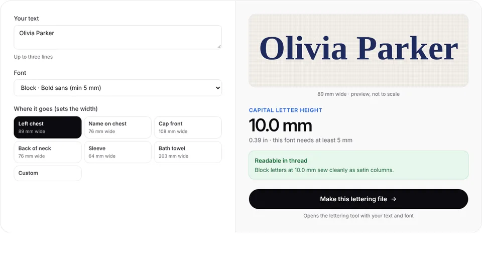
The lettering size calculator shows how tall a name comes out at a given width, per font, and tells you when it's too small. The small text guide explains why letters fill in below these sizes.
Try it with your own design
Sign up free, upload an image and get a stitch preview in under a minute.
Drop your image here
PNG, JPG, WebP or SVG · stays on your device
Name sizes by placement
| Placement | Name or design width | Letter height | Good fonts |
|---|---|---|---|
| Right chest name on a shirt or polo | 2–3.5 in (50–90 mm) | Capitals about 8–13 mm (0.3–0.5 in) | Block, Sport or another bold font |
| Name with a left chest logo | 3–4 in (75–100 mm) for the whole design | About 5–10 mm | Block or Sport |
| Cap front | Within about 4–5 in (100–125 mm) | At least 6–7 mm, all capitals | Block or Varsity |
| Back of the neck | 2–4 in (50–100 mm) | One line, the design about 0.5–1.5 in (12–40 mm) tall | Block or Tall |
| Sleeve or collar | 2.5–3.5 in (65–90 mm) on a sleeve | About 6–10 mm | Tall or Sport |
| Backpack pocket or flap | The flat area, with about 1/2 in (12 mm) clear | About 20–40 mm (0.75–1.5 in) | Block or Rounded |
| Kids' clothes | To suit the chest | About 15 mm or more | Rounded or a soft, bold script |
| Bath towel | 6–12 in (150–300 mm) | Script about 25 mm (1 in) or more | Script, Retro or Block |
| Baby blanket | To suit the corner or edge | About 40–50 mm (1.5–2 in) | Rounded or Script |
Names grow wide quickly: a ten-letter script name 2 in (50 mm) tall can run 8–9 in (200–230 mm) across. Check the width against your hoop with the hoop size calculator, and see the embroidery size chart for every placement, such as the right chest.
Long names, two lines and centering
- Split long names over two lines instead of shrinking them below the minimum. A first name over a last name, or a name over a short tagline, keeps every letter readable.
- Use a condensed font such as Tall or Sport where width is tight, like sleeves and collars.
- Center on the item, not the hoop. Fold the garment or towel in half to find the center, mark the center line and the baseline with chalk or a water-soluble pen, and line the mark up with the hoop's center marks.
- Center the lines on each other. Two-line names look best centered; the text to embroidery tool centers each line for you.
- Check names with tails. Letters that hang below the line, as in Peggy, pull the visual center down, so check the preview and nudge the name up if it looks low.
Print the name at actual size and tape it in place before you hoop. A name that looks centered on screen can sit too high on a small shirt or too close to a towel's border.
Stabilizer, topping and needle for names
| Item | Backing | Topping | Needle |
|---|---|---|---|
| T-shirt | No-show mesh or light cut-away (1.5–2 oz) | Not usually needed | 75/11 ballpoint |
| Polo (piqué) | No-show mesh (1.5 oz) | Water-soluble topping for small text | 75/11 ballpoint |
| Hoodie or sweatshirt | Medium cut-away (2.5 oz) | Water-soluble topping | 75/11 or 80/12 ballpoint |
| Woven shirt | Light tear-away (1.5 oz) | Not needed | 75/11 sharp |
| Structured cap | Cap backing (heavy tear-away) | Not usually needed | 75/11 or 80/12 sharp |
| Towel | Tear-away or wash-away | Water-soluble topping, always | 75/11 or 80/12 sharp |
| Tote bag | Medium tear-away (2 oz) | Not needed | 80/12 or 90/14 sharp |
These are the settings for light designs such as names; lettering on a filled background needs a heavier backing. The stabilizer finder gives the same advice for every fabric and density. A topping matters most for names: on piqué, fleece and towels it keeps thin satin from sinking into the texture.
Making the name file
- Measure the space on the actual item and decide the width, leaving a margin.
- Type the name into the text to embroidery tool, up to three lines, and pick a font. Check the letter height it shows against the minimums above.
- Choose the fabric type: knits and fleece get heavier underlay and more pull compensation.
- Pick a thread color with good contrast to the fabric, then check the stitch preview.
- Download your machine's format with a plan. Trying fonts and sizes is free.
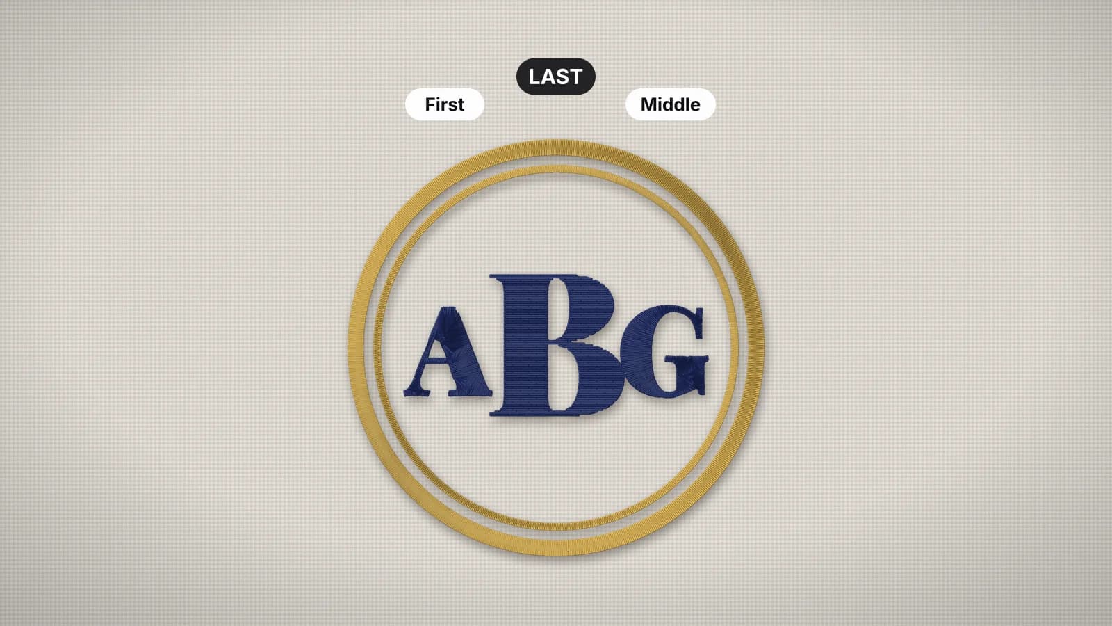
For a name that's part of a logo or artwork, upload the whole design to the digitizer with a free account instead, so the lettering and graphics are sized together. Initials have their own tool, the monogram maker, and the monogram guide explains which letter goes where.
Check and test-sew before the real piece
- Check the spelling against the order, letter by letter, including capitals and accents. Copy names from the customer's message rather than retyping them.
- Sew a test on a scrap of the same fabric with the same backing and topping. Names are quick to stitch, so a test takes minutes.
- Look at the small details: open counters in a, e and o, clean joins in scripts and even spacing.
- Check the back on towels and blankets, where both sides show, and match the bobbin thread to the top thread there if needed.
- Keep a record of the font, size and thread for each product, so repeat orders match.
Selling personalized items? A short list of tested fonts and sizes per product keeps every order consistent; the page for Etsy sellers covers the workflow.