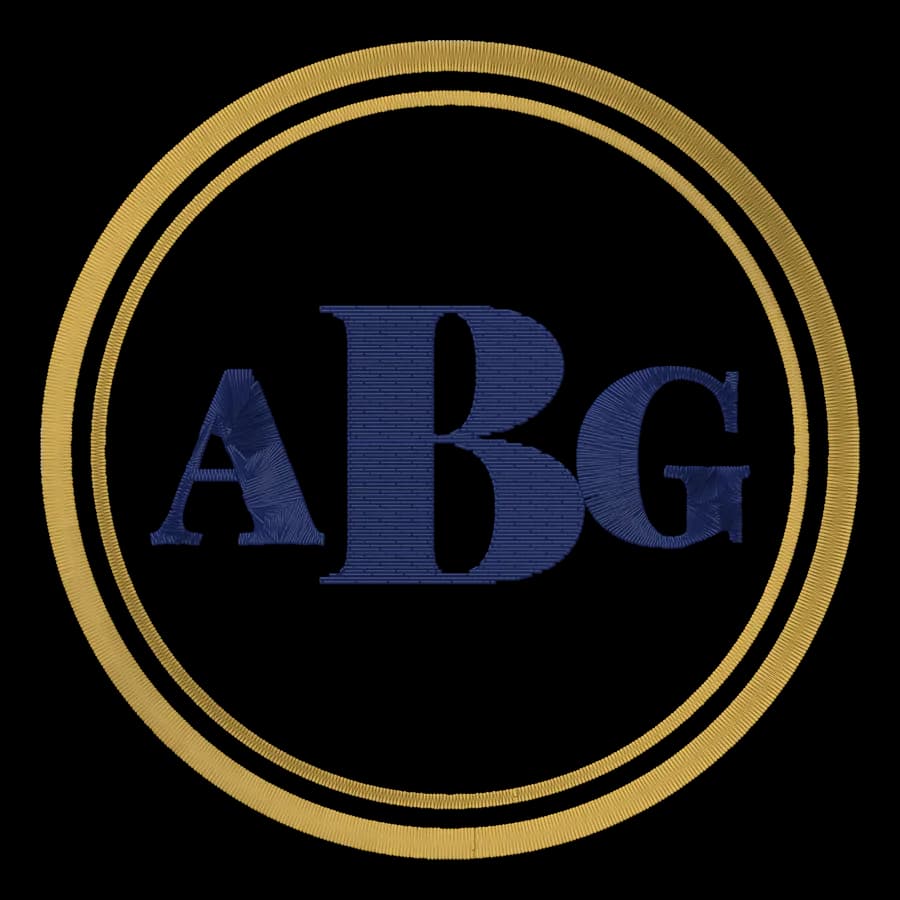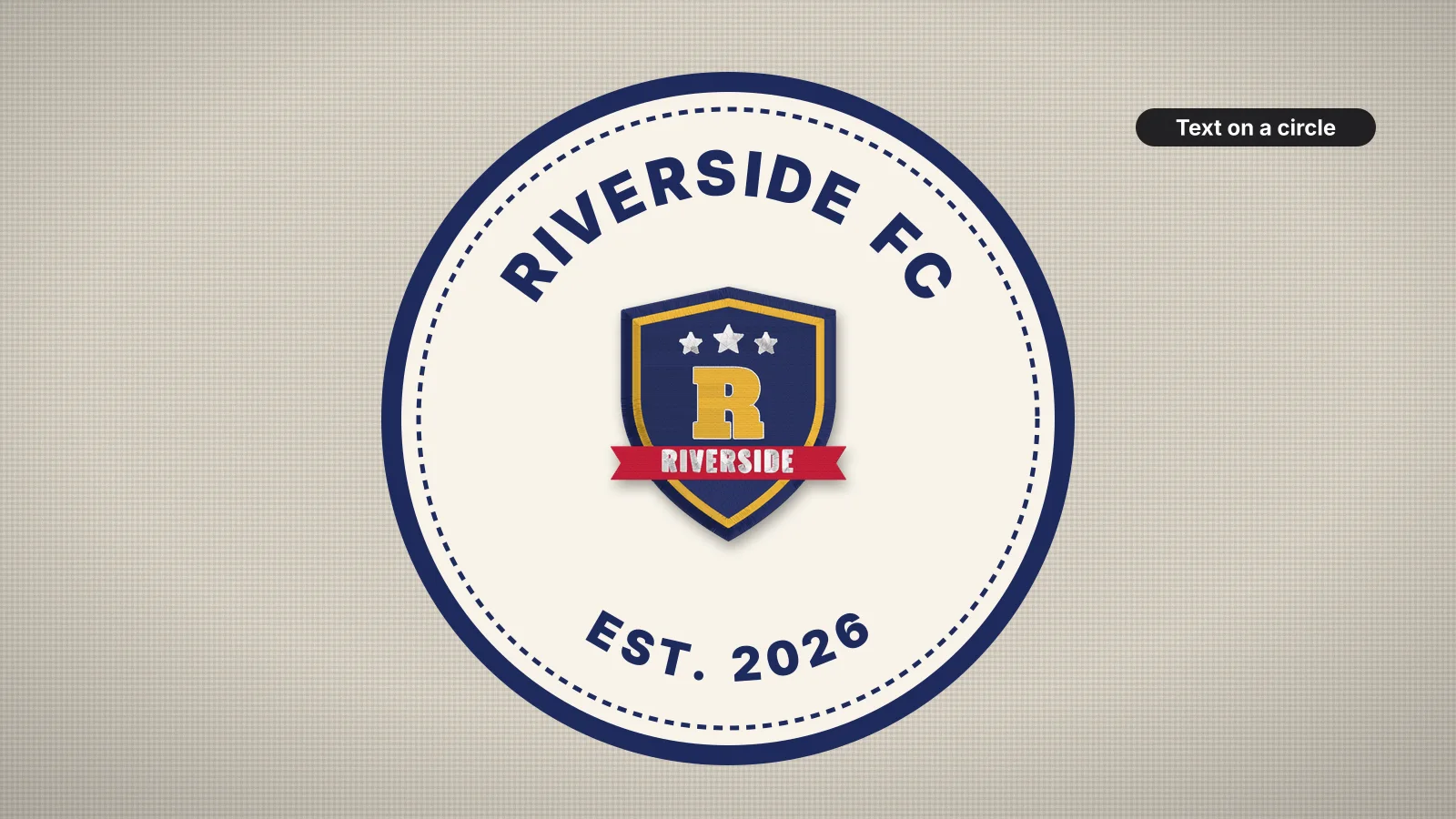
Curved lettering is everywhere in embroidery: a club name arched over a crest, a team name round a badge, a business name and a town set in a circle. Bending a line of letters changes how each one is spaced and how its stitches sit, so text that reads fine in a straight line can look crowded or uneven on a tight curve.
This guide covers the common layouts, how the radius changes each letter, spacing, readable sizes, satin or fill letters, centering and stitch order. The curved text tool arches a line of text over the top of a circle and another along the bottom; saving the file needs a paid plan.
Arches, circles and gentle arcs
| Layout | Example | Tips |
|---|---|---|
| Top arch | A club name curving over a crest | The letters stand on the curve, and the arch is centered over the logo |
| Bottom arch | A town or a year curving under a logo | The letters stay upright and read left to right, with their tops toward the center |
| Full circle | Text all the way round a badge or a seal | Usually a top arch and a bottom arch, split by stars or dots at the sides |
| Gentle arc | A name on a cap front or a jacket back | A large radius: barely curved and easy to read |
| Wave | A slogan that rises and falls | Fine for bold block letters, but harder to space evenly |
In a full circle, the top line sits on the inner edge of the ring and the bottom line's baseline runs along the outer edge, so both read the right way up and share the same band.
Radius vs letter height
On a curve, each letter becomes a wedge: the edge nearest the center of the circle is shorter than the edge farthest from it. Measured to the inner edge of the letters, the outer edge is longer by the letter height divided by the radius:
| Radius, as a multiple of letter height | Outer edge longer than the inner edge by | How it looks |
|---|---|---|
| 2× | 50% | Letters fan out sharply: crowded inside, gappy outside |
| 3× | About 33% | Clearly curved; workable for short words in bold capitals |
| 4× | 25% | A comfortable arch for most badges and crests |
| 5× | 20% | Reads almost like straight text |
| 10× or more | 10% or less | A gentle arc, as on a cap front |
As a rough guide, many digitizers keep the radius at least three to five times the letter height. If the text has to curve tighter than that, make the letters shorter, use fewer of them, or switch to a condensed font such as Tall, which fits more letters into the arc.
Measure the radius to the inside edge of the letters. For a 10 mm tall name round a logo, that means a radius of at least about 30–50 mm, so an inner circle about 60–100 mm across.
Try it with your own design
Sign up free, upload an image and get a stitch preview in under a minute.
Drop your image here
PNG, JPG, WebP or SVG · stays on your device
Letter spacing on a curve
- The inside edge crowds. On a top arch the feet of the letters get closer together; on a bottom arch the tops do. Open the letter spacing a little until the inner edge looks even.
- Space by eye, not by numbers. Round letters such as O and C, and open ones such as L and T, look farther apart than straight ones. Nudge them until the gaps look equal.
- Keep word spaces generous, so separate words still read as words once the letters fan out.
- Don't stretch text to fill a circle. Keep each line to less than about half the circle, and leave space at the sides for stars, dots or a small motif.
- Watch the counters. Crowding at the inner edge fills in A, B, e and R first. If they close up, the radius is too tight or the letters too small.
Readable sizes for curved lettering
Curving doesn't change the smallest size a letter can be stitched at, but it does make small text harder to read, so many embroiderers add a millimeter or so:
| Where | Letter height | Notes |
|---|---|---|
| Left chest badge or crest | About 5–8 mm on smooth wovens, 7–10 mm on polos | Bold capitals, in a design about 3–4 in (75–100 mm) across |
| Cap front arch | About 7–10 mm | A gentle arc reads best on a curved crown |
| Round patch or badge | About 5–8 mm on a 3 in (75 mm) patch | Leave room for the border |
| Jacket or hoodie back | About 25–50 mm (1–2 in) | Big arches can carry a classic serif or a varsity font |
| Towel or blanket | About 15–25 mm | Bold fonts, with a topping on pile |
The lettering size calculator shows how tall text comes out at a given width, and the small text guide explains why letters fill in below these sizes.
Satin or fill letters
| Letters | Stitch | Why |
|---|---|---|
| Strokes up to about 7 mm wide | Satin | Smooth and shiny; the stitch angle turns with each letter round the curve |
| Wider strokes on big lettering | Fill, often with a satin or running outline | Satin longer than about 7 mm lies loose and snags |
| Small lettering | Satin, in a bold font | Running-stitch letters are thin and hard to read from a distance |
| Script on a curve | Satin, on a gentle arc only | Script joins are drawn for a straight line and break up on tight curves |
Each letter on a curve is rotated, so its satin columns turn with it. That's what makes curved satin text look smooth, and why a curve that's too tight piles stitches up at the inner end of each column. The satin vs fill guide and the stitch angle entry explain more.
Centering and stitch order
- Center the arch on the logo's center line. The middle of the text, not the first letter, goes at the top of the arch. With an even number of letters, the gap between the middle two sits on the line.
- Share the logo's center. Arched text round a round logo should use the same center point, with a gap of about 5–10 mm between the text and the logo.
- Sew in reading order, letter by letter along the arc, so each move to the next letter is a short jump.
- Sew the logo first and the text after in most designs, so the lettering sits crisply on top.
- Mind the fabric pull. On knits, a ring of text can sew slightly oval. Enough pull compensation and the right backing keep it round.
Practice on a free design
114 ready-to-sew designs in every machine format, free with an account.
Making a curved text file
- Text on its own: the curved text tool sets a top line and a bottom line on a circle, in 12 embroidery fonts, at the circle size and letter height you choose. Saving the file needs a paid plan.
- Text with a logo file: put the curved text and the logo together in the design combiner; the combining guide covers gaps and order.
- Curved text already in your artwork: upload the whole design to the digitizer, so the text and the logo are sized together. Its design check flags lettering under about 5 mm. Digitizing and previewing are free with an account.
Whichever route you take, check the preview for crowded counters on the inner edge, then test-sew on a scrap of the same fabric. The lettering guide covers digitizing text in more depth.